
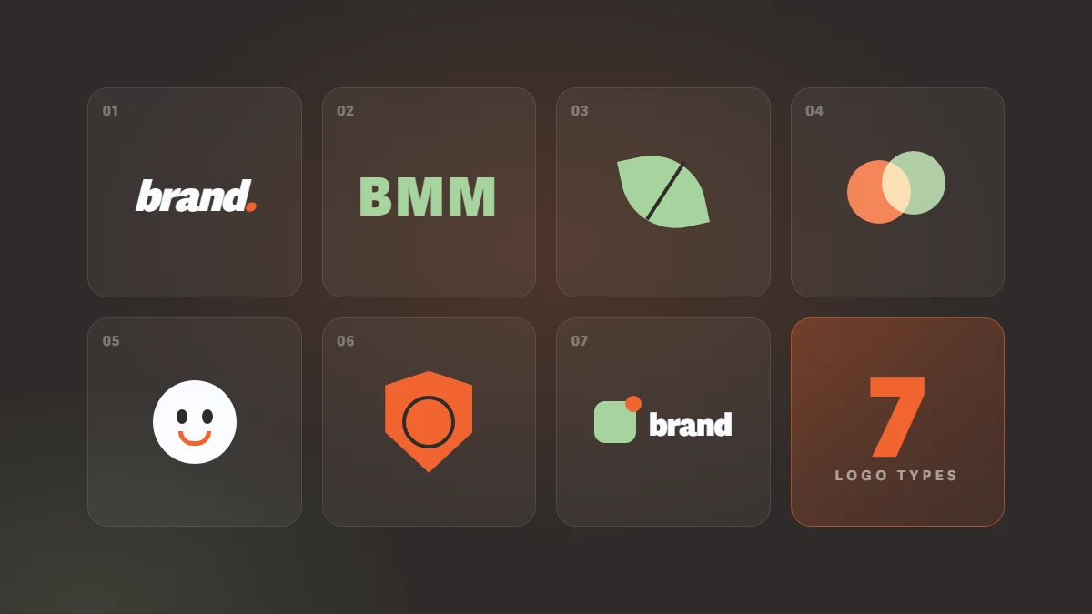
Have you ever recognised a company from a tiny symbol without even reading its name?
A bitten apple, a simple swoosh, or a few carefully designed letters can be enough to bring an entire brand to mind.
That is the power of a great logo. But a logo is more than a good-looking graphic. It is one of the most recognisable parts of your brand identity, and different logo styles serve different purposes.
Whether you are launching a business or refreshing an established brand, understanding the types of logos can help you make a more confident design decision. Here are seven major styles worth knowing.
1. Wordmark: When Your Brand Name Says It All
With a wordmark, the name is the logo. There is no separate icon: the personality comes from the typography, letterforms, spacing and colour.
Coca-Cola is a classic example. Its distinctive lettering has become instantly recognisable without needing an additional symbol.
Wordmarks are often a strong choice for businesses with short, distinctive, memorable names. But do not mistake simplicity for ease: creating a memorable wordmark requires thoughtful, skilled typography.
2. Lettermark: Big Identity, Just a Few Letters
What if your company name is long? Putting every word into your logo may not be the best solution.
A lettermark uses initials to create a compact, memorable visual identity. IBM is a familiar example: three letters, given a distinctive design, have become a globally recognised mark.
This approach works particularly well for organisations and businesses with lengthy names. If your company is new, however, make sure people also see the full name while they are getting to know your brand.
3. Pictorial Mark: One Image, a Thousand Words
Sometimes a single image can do the talking. A pictorial mark is built around a recognisable real-world object, animal or visual element.
Think of Apple. Its bitten apple symbol is now closely associated with the company, even without the brand name beside it.
The advantage is simplicity and memorability. The challenge is recognition: a new business usually needs time and consistent branding before customers connect an unfamiliar symbol to its name.
4. Abstract Mark: Creativity Without Literal Limits
A logo does not have to depict something that exists in the real world. Curves, shapes and geometric forms can create a distinctive visual identity of their own.
The Nike Swoosh is a famous example. Rather than literally illustrating a product, the symbol has become associated with movement, energy and athletic performance.
Abstract marks can be a great fit for tech companies, startups and brands seeking a unique, modern identity. There is one catch, though: a beautiful shape is not automatically a meaningful logo. The concept should connect to the brand's personality and positioning.
5. Mascot Logo: Give Your Brand a Personality
Some brands have more than a symbol. They have a character.
A mascot can be a person, an animal or an imaginary figure designed to make the brand feel recognisable and approachable. Colonel Sanders in the KFC identity is a well-known example.
Mascots can be particularly effective for restaurants, family-focused products and brands with a friendly voice. Just remember that highly detailed characters may become difficult to recognise at smaller sizes.
6. Emblem: Heritage and Trust in One Badge
Think of university crests, traditional clubs or long-established brands. An emblem typically places words and graphic elements inside one unified shape, such as a badge, seal or shield.
Harley-Davidson provides a recognisable example of this style.
Emblems often communicate heritage, credibility and tradition, making them attractive for educational institutions, clubs and classic brands. Their potential weakness is detail: an intricate emblem may lose clarity on a mobile screen or at small sizes.
7. Combination Mark: The Best of Both Worlds
Why choose between a name and a symbol when you can use both?
A combination mark brings typography and a graphic element together. Burger King is a familiar example, using its name with distinctive visual shapes to create a cohesive identity.
The biggest benefit is flexibility. With a well-designed logo system, you can prepare a complete version, a horizontal layout and, where appropriate, a standalone icon for different uses.
For many new businesses, a combination mark is a practical starting point: it introduces the company name while helping people become familiar with its visual symbol.
How Do You Choose the Right Logo Style?
There is no one-size-fits-all answer. Consider your brand personality, your target audience, the length of your business name and where the logo will appear.
A creative startup might suit an abstract mark. A heritage institution may favour an emblem. A new business that needs to build name recognition could benefit from a combination mark.
If you operate in Dubai or elsewhere in the UAE, multilingual branding matters too. When your identity needs both English and Arabic versions, readability and visual consistency should be considered early in the design process.
What Makes a Logo Work?
Whatever style you choose, a strong logo should be simple, distinctive, appropriate for the brand and usable at different sizes. It should look as convincing on a large sign as it does on a small phone screen.
Monochrome versions, light- and dark-background variations, and clear usage guidelines are also important. Above all, a logo should belong to a cohesive visual identity, not exist as an isolated graphic.
From a Logo to a Brand People Remember
Your logo is a starting point, not the whole story. Your colours, typography, imagery and brand voice should work together to create a consistent identity.
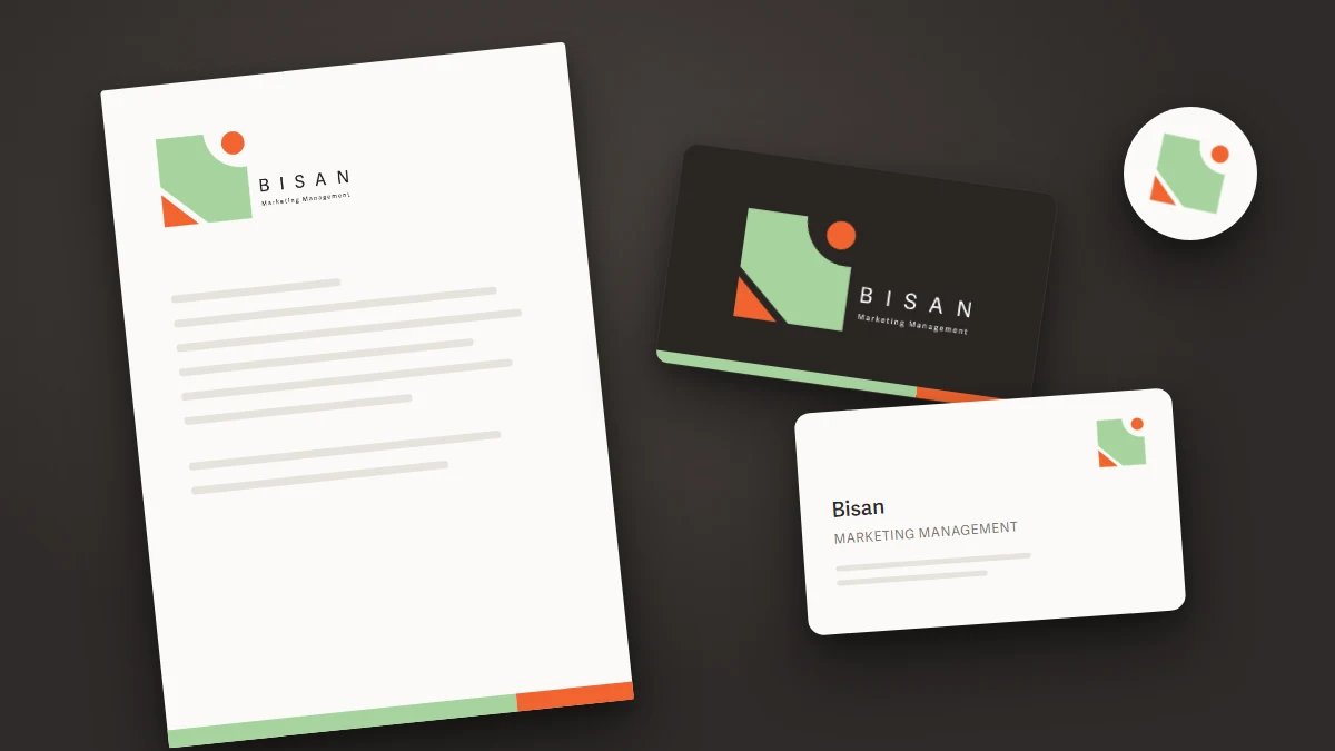
At Bisan Marketing Management, we see branding as more than designing a logo. It is about building a visual identity that reflects who you are and stays with your audience.
Launching a new business in Dubai or thinking about a brand refresh? Explore Bisan's branding services and discover how we can help bring your brand to life.
Your brand has a story to tell. Let's make it memorable.

Discussion & Insights
Loading...